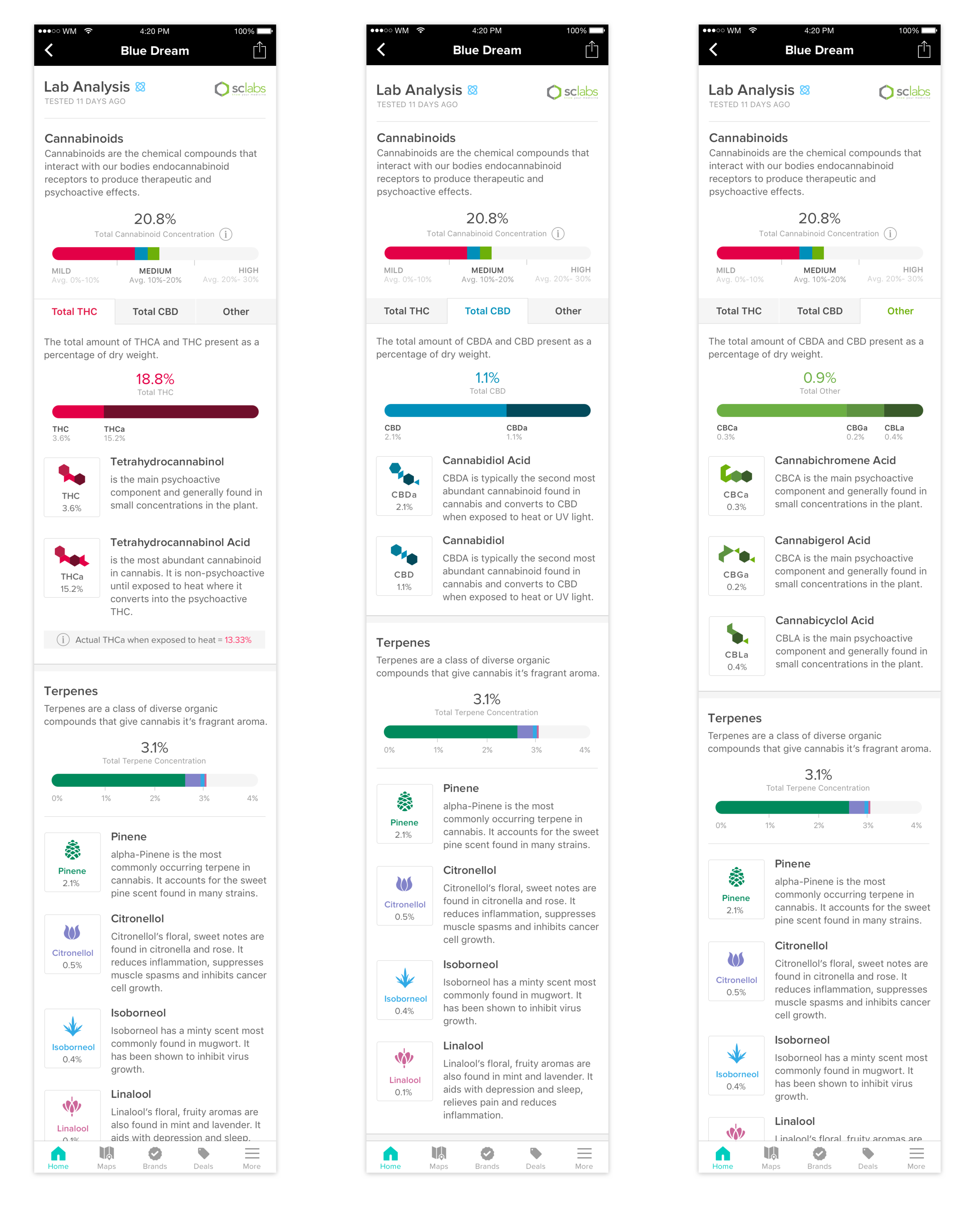
Lab Analysis
PROJECT OVERVIEW
Weedmaps' core product is to help customers connect with dispensaries who have products for their needs. However, there isn't any scientific breakdown of each product's effects, as this knowledge is still being standardized through research and legalization. The project's goal was to educate people and help them understand the medical results that marijuana has on the body.
Role
Product Designer
Year
2016
DESIGN PROCESS
When new features needed to be designed and implemented within a short period, we employed lean research practices, including A/B testing and in-person interviews, using both Invision and Lookback.io. First, we attempted to group the terpenes into categories. The problem is no scientific classification could apply to the foundation of current terpenes categories. With the data attained from SC LABS, we came up with a system on classifying the terpenes into seven groups in association with their scents.
User flow
Solving a design problem is mostly finding order in chaos. As designers, we start with an abstract idea that will eventually become a concrete useable product. To help visualize and combine our research, We created a user flow to analyze and validate users' requirements.
UI DESIGN
Interactive Graph
We wanted to present an experience that was friendly, familiar, and communicative. Our final design direction was shaped by considering globalization since some of our users were overseas; thus, using the shape of a marijuana leaf alongside the classification of the seven terpene groups, an interactive graph was created displaying the dominant cannabinoid and terpenes in the product.
MVP
After several rounds of critique and clean-up sessions, we came up with a simple layout that highlights two graphs highlighting the percentage of cannabinoid and terpene groups along with a detailed description of each compound.
InteractiON
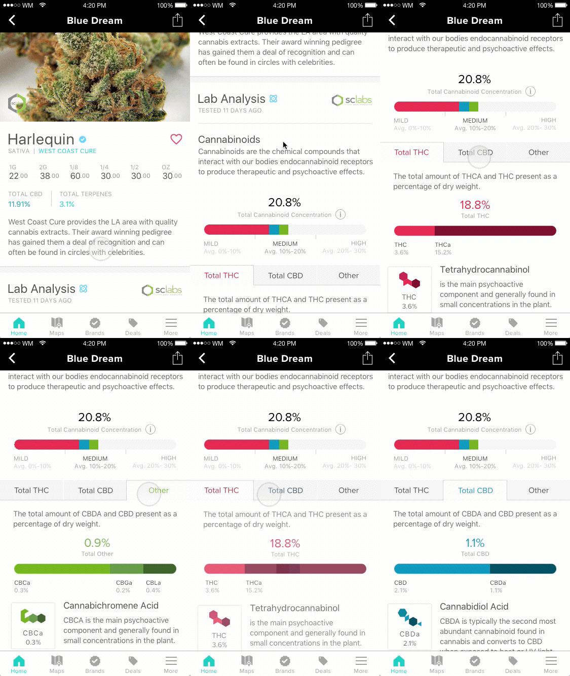
We were trying to build this epic marijuana shopping experience. We did AB testing on different layouts and finally decided to go with this one.
Interesting Findings
After exploring the visualization and conducting a series of user test, we found some interesting insights:
○ A user stated that in most cultures people are trained to read from left to right. Validating our decision to include a tab view in the design.
○ The terminology was too scientific for our user base, so we decided to work with a content strategist to better explain the terms.


